““Remember that pigment is one thing and that light is another.””
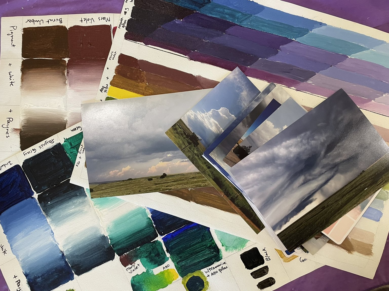
Choosing colors is a lot of work! I need to decide on my palette before I get started painting the mural. It isn’t easy to go back and change things on a ninety six square foot surface! I have a few limitations. I’m using Nova Colors, an industry standard for murals. There are fewer colors to chose from that are highly stable and permanent in outdoor conditions. Another limitation is the nature of the acrylic paint on a mural. I won’t be layering and glazing to create luminosity. I’ll have to build and create the sense of atmosphere and luminosity using the colors themselves.
The first step in deciding which colors to use is to create studies. The studies have samples of full saturation, blending with white, blending with each other. I almost never use black because it deadens a painting. Almost-black can be achieved by combining colors with their (almost) compliments. True black rarely occurs in nature, even shadows. Using really deep tones will make the color vibrate. I play with combinations of opposites and blend them to find other neutral colors. Warms, cools. Which colors wash out, which ones maintain vibrancy? Which colors can I use to create a sense of atmosphere and distance using white without washing it out too much? Can I use bright, saturated colors to create the illusion of objects almost sticking out of the foreground through the “fourth wall”? So many questions, so much experimenting to do!

