Now that I’ve finished most of the mural, the hardest part is last. It was ambitious of me to include a portrait of Henri himself in the mural. It will have a completely different feel and aesthetic than the rest of the mural, making it look like it is floating in the foreground.
One difference is the use of brushstrokes to build texture and emotion. Another is using a different color palette. I chose a warm palette for this foreground and a cool one in the background to emphasize the feeling of closeness and distance, respectively.
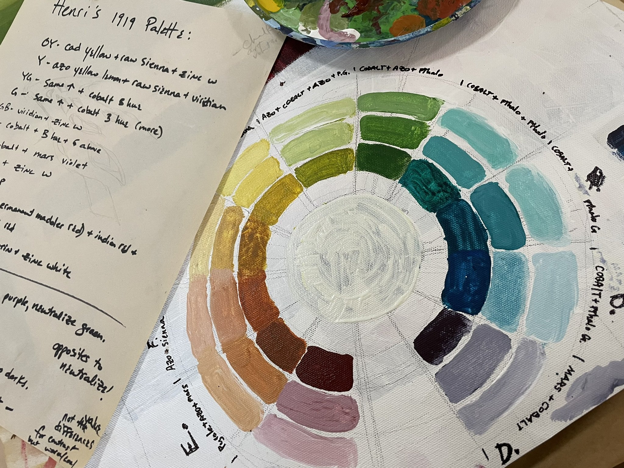
Although I am not imitating Henri’s style in this portrait, I am using some of his techniques, which includes approximating one of his color palettes. I did some research and settled on what has become known as the ‘1919 Palette’. I found an excellent article about this (attentiveequations.com/the-triangular-palette-of-robert-henri/). The author has a forthcoming book, “The Color Investigations of Robert Henri”, but unfortunately it isn’t out yet and I didn’t get a chance to use it in my research. But I will continue to explore Henri’s color theories even after the mural is done!
My palette is limited to the best lightfast colors for a mural application. Here’s an explanation of lightfastness on the Nova Color website (the brand of acrylics that I am using for this mural). “To minimize color fading due to sunlight you must be alert to the lightfastness rating of the pigment used in the paint. Some pigments fade more readily than others. The American Society for Testing and Materials (ASTM) Standard D5098 rates the lightfastness of pigments. Lightfastness I is the highest rating. Within the Lightfastness 1 rating some colors are more durable than others.” (novacolorpaint.com/pages/faq). With this in mind, there is only one yellow that is recommended for this kind of application, Azo Yellow. Fortunately it is a good, flexible yellow that mixes well with most other colors.
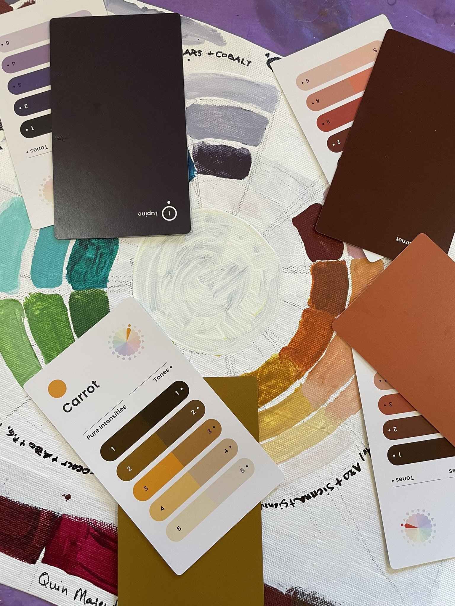
After finding the pure colors that I wanted to work with, I created more colors based on them by adding white. (This is referred to as tint).
To get shadows and darker colors or to neutralize the colors, I’m adding opposites and deep tones of color, because I don’t want to add black, which really deadens a painting.
I invited a guest artist to help me to perfect the proportions and gestures of the figure of Henri. She happens to be my daughter, Katie Lara-Steely, who is a very talented artist. It was a treat to have her visit and spend a few days with me in the studio immersed in creativity and working on art!
This is the final phase of the mural, and it will be done and delivered to Cozad a week from today. I’m relieved to wrap up such a big project, but I will miss it’s presence in my studio.


